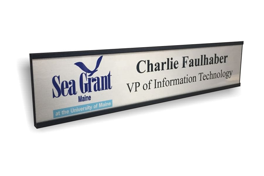
Ordering custom name plates for your office might seem straightforward, but a few common mistakes can lead to a final product that doesn’t quite meet your needs. From choosing the wrong size to selecting an inappropriate material, these errors can compromise the functionality and aesthetic appeal of your office name plates. Here’s a guide to help you avoid the top five pitfalls when ordering custom office name plates, ensuring your investment is both functional and stylish.
1. Choosing the Wrong Size
One of the most frequent mistakes is ordering name plates that are either too large or too small for the intended space. Oversized name plates can look out of place and overwhelm a desk or wall, while undersized plates might be hard to read, defeating their purpose, especially if there will be a lot of elements and/or text in the design.
How to Avoid It:
Before placing an order, measure the space where the name plate will be displayed. For office wall name plates, consider the overall wall size and the viewing distance. For desk name plates, ensure they fit comfortably on the surface without taking up too much space. Take your employee names, titles, and department names (or any other text you might want to include) and opt for a larger name plate if the majority of them have many characters. If you’re unsure, consult with your name plate provider—they can often recommend the best size based on your specific needs.
2. Selecting an Inappropriate Font
The font you choose for your custom name plates is more important than you might think. A font that’s too elaborate can be difficult to read, especially from a distance, while a font that’s too plain might not convey the professional image you’re aiming for. If you’re in an executive setting, you’ll want to avoid fun and charismatic fonts like Comic Sans, while on the other hand, fonts like that might be a perfectly suitable and aesthetically pleasing option for teacher and student name plates in grade schools.
How to Avoid It:
When selecting a font, prioritize readability and take into consideration the typical distance each name plate will likely be viewed from. Sans-serif fonts are often a good choice for office settings because they’re clean and easy to read. If you want to add a touch of style, opt for a font that’s still clear at a distance. Remember to consider your company’s branding—your font choice should align with your overall corporate identity. Look at fonts from your logo to really tie in the corporate image.
3. Ignoring Material Options
Another common mistake is not giving enough thought to the material of your name plates. Different materials offer various levels of durability and aesthetic appeal. For example, metal name plates exude professionalism and longevity, however, they can also be reflective and lead to not being easily read from a distance under certain lighting conditions. Meanwhile, UV-printed name plates allow for vibrant, full-color designs, but may be less durable if exposed to harsh conditions without proper protection like and over-laminate.
How to Avoid It:
Consider where the name plates will be used. For high-traffic areas or environments where the name plates might be exposed to weather or wear and tear, go for durable materials like metal or engraved materials and printing styles. For areas where aesthetics are more critical, such as reception desks, UV-printed name plates might be the better choice. Discuss your specific needs with your supplier to find the best material for your application.
4. Overlooking Mounting Solutions
The way your name plates are mounted is just as important as the plates themselves. A poorly chosen mounting solution can lead to name plates that are unstable, hard to read, or that don’t stay securely in place. Additionally, making sure you have adequate wall space available if using a slide-in metal mounting holder is important. If the door jamb or an adjacent wall is too close to the name plate holder, you won’t be able to successfully remove the name plate to change it out as needed without removing the entire holder from the wall leading to potential damage.
How to Avoid It:
Evaluate the mounting options available for your chosen name plates. Metal slide-in wall holders are a popular choice for their sleek appearance and ease of use, provided you’ll have enough available wall space on at least one side to get the name plates in and out as needed. Maybe opt for tape, magnetic, or a Velcro option instead if space is limited. For desk name plates, consider stands that complement the material and design of the plate. Ensure the mounting solution is appropriate for the environment where the name plates will be displayed—whether on doors, walls, or desks.
5. Failing to Consider Future Needs
Lastly, businesses often forget to plan for future changes. Whether it’s a rebranding initiative, an office move, or simply new employees joining the team, your name plates should be flexible enough to adapt.
How to Avoid It:
When ordering name plates, consider how easily they can be updated or replaced. Opt for designs and materials that allow for easy changes, such as slide-in holders or modular systems. Additionally, order a few extra plates and holders for future use, so you’re not left scrambling when changes occur. If you anticipate an artwork change in the near future or that your brand colors might be updated, choose to order your name plates in a generic color scheme for now and maybe choose to forego including a logo.
Conclusion
By avoiding these common mistakes, you can ensure that your custom name plates are not only functional and stylish, but also a long-term asset to your office. Remember to choose the right size, select a readable font, consider the material carefully, pick appropriate mounting solutions, and plan for future needs. With these tips in mind, your office name plates will make a professional and lasting impression. If you need any help, we’re always here and want to ensure you’re 100% satisfied with your name plates, so reach out to one of LoneStar Badge and Signs’ experts today.

