Make sure your photo ID badges are picture-perfect.

In recent years, many businesses have gone paperless for various reasons, whether to be environmentally friendly or to cut down on costs. Even so, most companies agree that the business card is valuable. These small cards are easily exchangeable and function as mini advertising tools.
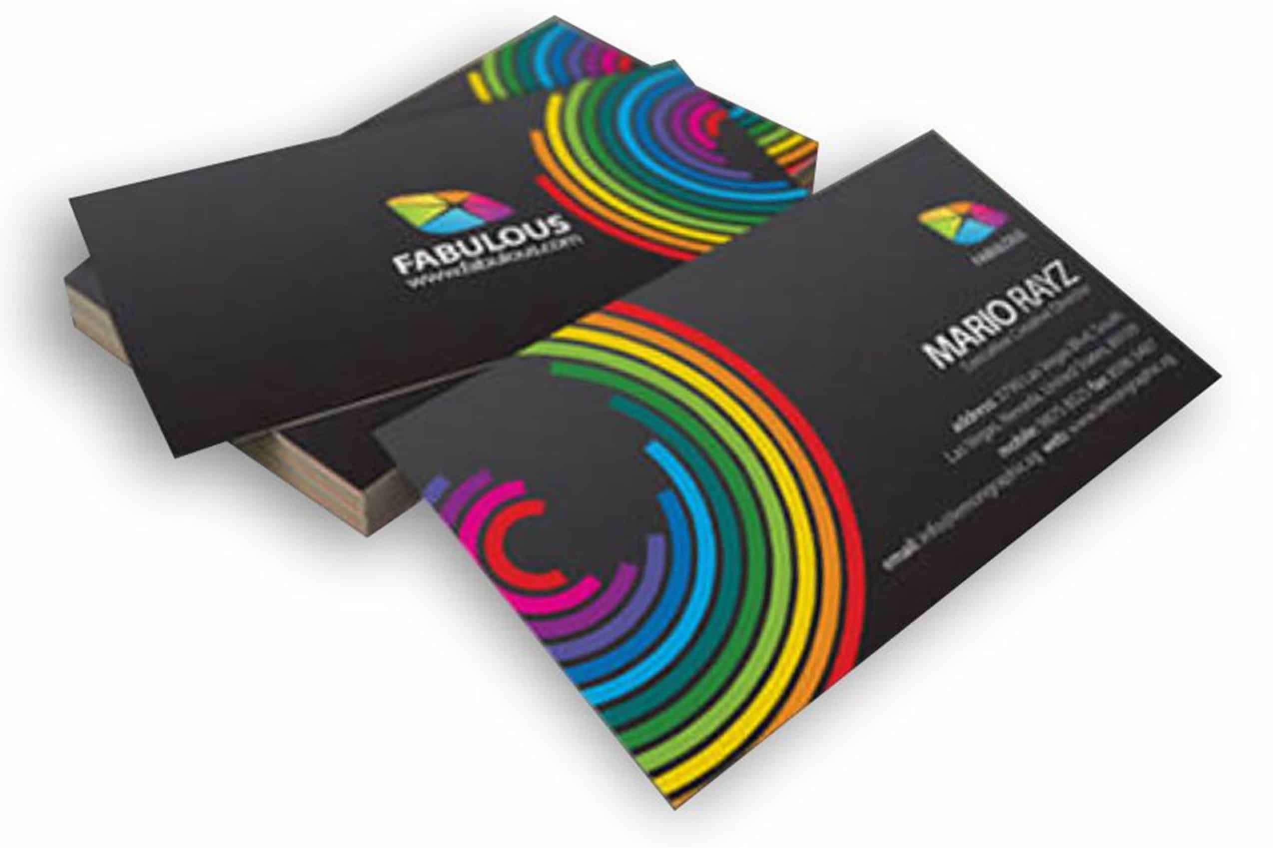
But if you want business cards that work, you need an effective, original design and high-quality materials. Cards that use low-weight paper and feature the same clipart as a competitor’s business down the street don’t stand out (at least not for the right reasons).
We’re here to help prevent that from happening to you! By the end of this article, you’ll know how to design business cards that help you stand out and advertise your business.
Ready to upgrade your current business card? Here are some design tips:
Do: Find a typeface
The font you choose for any marketing materials should represent your brand. For example, a massage therapist may prefer an elegant script, while a pediatrician may use a whimsical font. Choose whatever you find attractive, but make sure it’s easy to read. Size the text at least 8 pts, but make sure your name (and company’s name) stands out.
You can make a name stand out by:
- Using larger font size
- Choosing different typeface
- Putting letters in bold
Use a design that is aesthetically pleasing to you but still easy for your potential customers to read.
Do: Get the right shape and size
The amount of information you can include on your business card will depend on the card’s physical design. Traditional business cards are about the size and shape of a credit card, with the information presented horizontally. It’s always a safe choice, but if you want your business to stand out, try using a square shape, rounded corners, or vertical orientation.
Don’t: Forget key information
A business card should present customers with contact information in an organized fashion. Ensure your card tells customers how or where they can find you online, your company’s physical address, and a phone number. It is helpful to list an email address and social media handles, too.
Don’t: Crowd the card
Your card needs white space to draw attention to the most critical information. Too many elements on the card can distract the reader and pull their eye away from what they should be paying attention to: your contact information!
Common Mistakes When Designing Business Cards
When thinking about how to design business cards, remember that your business card is an extension of your brand. Having marketing materials with errors can be devastating for your company’s reputation.
Avoid these common business card mistakes made during the design process:
- Omitting contact information
- Using outdated information
- Misprinting information (typos)
- Forgetting to brand (leaving off your logo, colors, etc.)
- Using poor quality images
- Using low-quality card stock
- Leaving the back blank
- Choosing unreadable print
A business card is small but conveys a powerful message about your business.
Whether you’re starting your first business or have been established for years, you’ll need high-quality products to promote your company’s branding. Check out the selection of business card options in our online store!


