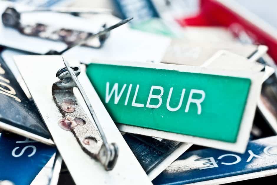
Choosing a name tag design is an art that blends practicality with personality. A well-designed name tag should speak volumes. It can echo your brand, set the tone for interactions, and make introductions seamless. We’ll discuss some tips for choosing a name tag design that stands out.
Font Choices on Name Tag Design
Think about the last time you looked at a name tag for a long period, trying to decipher whether that was an ‘l’ or an ‘i’. Fonts can make or break the readability and professional appeal of a name tag. Selecting just the right typography for your personalized name badges isn’t only about style; it’s also about function.
Font Style
Serif fonts, like Times New Roman, whisper hints of tradition and respectability, perfect for law firms or historical institutions. On the flip side, sans serifs such as Arial sing modernity and approachability, a go-to for tech startups or casual eateries. Whimsical fonts like Comic Sans might not be taken seriously unless you’re hosting a children’s event.
Font Weight
A heavyweight font grabs attention but could come off as overbearing if used excessively. Meanwhile, lightweights might struggle under pressure. A middleweight contender like Helvetica provides a knockout balance between assertiveness and subtlety. Don’t overlook making text bold when emphasizing names over titles as well.
Font Readability
You want people to read your name from across the room without invading your personal space. This means opting for clarity over flair every time because when ‘John’ becomes ‘Johm’ due to fancy lettering gone wrong, that’s name confusion nobody wants. Make sure your text size doesn’t force people into an impromptu eye exam as well.
Material Used: Name Tag Durability and Aesthetics
Picking the right material for a name tag has to be spot on.
- Metal tags are sleek, durable, and oozing with professionalism. They’re great when you want that extra shine at formal events.
- Plastic is perfect for daily wear and tear. Plastic badges can handle being tossed around during those rush-hour scrambles.
- Wood stands out just enough to say ‘eco-friendly’ and ‘unique’ without screaming it from across the room.
The choice of material also speaks volumes aesthetically; it tells a story about your brand before you even utter a word. So make sure what you pin on says exactly what you intend to communicate because people are unintentionally paying attention.
Color Coordination for Effective Branding
The right color palette can be the silent ambassador of your brand, speaking volumes without uttering a word. Colors evoke emotions and associations that can affect your brand image.
A dash of red might shout confidence while blue whispers trustworthiness. Here are some colors that are associated with specific industries:
Healthcare: Blues and Greens
These colors are often associated with a sense of calm, trust, and well-being in healthcare settings. Lighter shades of blue can create a serene environment, while greens may evoke feelings of freshness and nature. Healthcare name badges in this color promote a sense of comfort and relaxation in medical spaces.
Technology: Silver and Metallic Tones
Technology companies often use silver and metallic colors to convey a sleek and modern image. Silver is associated with innovation, sophistication, and a futuristic aesthetic. It suggests cutting-edge products and a forward-thinking approach.
Finance: Blues and Greens
Similar to healthcare, blues and greens are also prevalent in the finance industry. These colors convey stability, trust, and reliability. Darker shades of blue, in particular, are often used to instill a sense of security and confidence in financial institutions.
Food and Beverage: Warm Tones (Reds, Yellows, Oranges)
These colors are commonly used in the food and beverage industry to stimulate appetite and convey a sense of energy and excitement. Fast-food chains often utilize bold reds and yellows to grab attention and create a sense of urgency.
Environmental and Sustainability: Earthy Greens and Browns
Companies focused on environmental sustainability often use earthy tones like greens and browns. These colors reflect a connection to nature, eco-friendliness, and a commitment to environmental responsibility.
Fashion: Varied and Trend-Driven
The fashion industry is highly dynamic, and color trends can change rapidly. Fashion brands often experiment with a wide range of colors to evoke different emotions and appeal to various consumer preferences. The use of colors in fashion is often tied to cultural trends and seasonal influences.
Automotive: Blacks, Silvers, and Reds
Automotive brands often opt for neutral colors like black and silver to convey sophistication and timeless elegance. Red is frequently used to signify energy, speed, and passion. Each color choice can influence the perceived style and personality of the vehicle.
Education: Primary Colors
Educational institutions often use primary colors like red, blue, and yellow to create a vibrant and stimulating environment. These colors are associated with energy, focus, and creativity, fostering an engaging learning atmosphere. This is perfect for university name tags and school name tags.
Real Estate: Neutral Tones (Beiges, Whites, Grays)
Neutral colors are prevalent in real estate to create a sense of neutrality and allow potential buyers to envision their own style. Whites and grays convey modernity and cleanliness, while beiges can suggest warmth and a timeless aesthetic.
Entertainment and Arts: Vibrant and Diverse Colors
The entertainment industry often embraces a wide spectrum of colors to convey creativity and excitement. Bright and bold colors are used to capture attention and reflect the dynamic nature of the arts and entertainment world.
The Importance of Contrast
Choose colors that complement workplace attire whether it’s corporate suits or aprons at coffee shops. Many good designs fade into the fabric because contrast wasn’t thought about.
Remember: if it doesn’t stand out, it might as well not be there, and getting noticed is half the point.
Size Specifications for Optimal Name Tag Functionality
Picking the right size for a name tag is all about balance. Go too big, and you’ll swamp your outfit; too small, and no one can read your name from across the room. Here are some tips to take note of:
- Avoid going under 1×3 inches unless you’re after an accessory rather than a functional badge.
- Larger tags may suit events where names are more important than roles or companies represented, such as in trade show name tags.
Create the Perfect Name Tag Today
Choosing a name tag design involves a delicate blend of practicality and personality. A well-crafted name tag is not merely an identifier; it serves as a visual ambassador for your brand, setting the tone for interactions and making introductions seamless.
We offer a wide range of high-quality products, including custom name badges, name tags, desk and wall name plates, signs, graphics, badge accessories, and custom projects. Get the perfect name badges from our customization options today.

